Unlocking the Secrets of Garden Productivity

In this article, I’ll share my experience using large language models (LLMs) to digitize handwritten garden yield data and perform analytics, exploring the intersection of technology and gardening.
Introduction
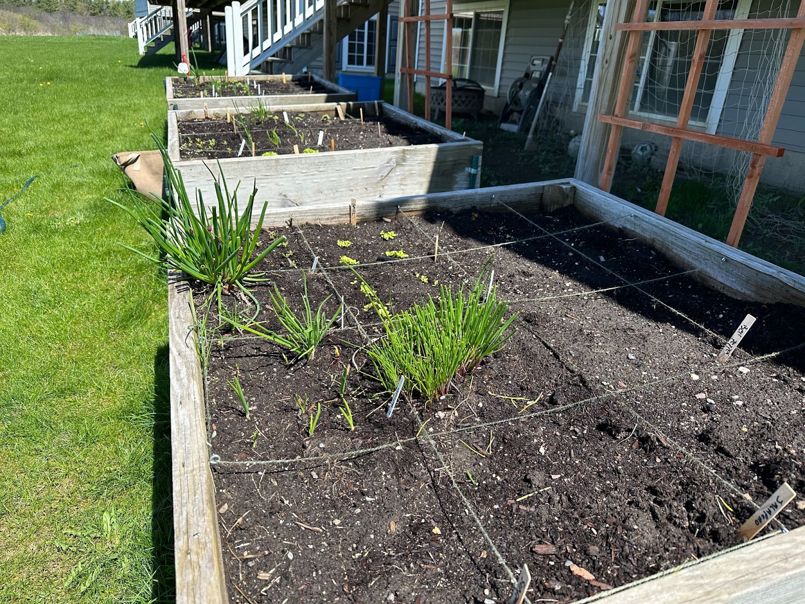
Several years ago, I wanted to start a small garden. The problem? I didn’t know anything about gardening and didn’t have much space. After doing a bit of research, I started using the Square Foot Gardening system, invented in 1975 by Mel Bartholomew. Being a former engineer and efficiency expert, Mel wanted to solve the problems of inefficiency and wastefulness in single-row gardening. Essentially, the square-foot garden method is a high-density gardening method that uses about 20% less space than a traditional row garden and 10% of the water.
Square foot gardening involves creating 4’x4′ raised beds divided into sixteen 1’x1′ squares, with specific planting formulas for each square. For example, within each 1’x1’ square, you can plant:
- 16 radishes
- 9 onions
- 4 lettuce plants
- 1 tomato plant
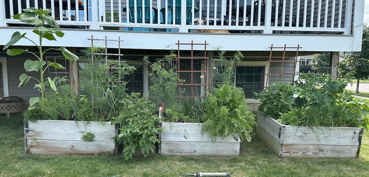
Here’s a picture of my square-foot garden from earlier this year–I happen to have 3 4’x4’ raised beds.
Over the years, I have weighed my harvest and tracked it in a simple Google Sheet, but opening up a Google Sheet every time I go to my garden and pick something is a bit onerous, so I simply write it down on a piece of paper and then transcribe it to a Google Sheet at some other time.
Being a curious and somewhat lazy fellow, I decided to see if an LLM could do the work for me. This blog will share my experience using a LLM to digitize my handwritten notes, combine them with my historical data, and perform light analytics on the data.
Data Collection and Preparation
Data Sources
To perform the analysis, I collected data from three primary sources:
- Historical garden yield data: This data was recorded from my garden from 2018 until today, capturing the types of crops grown, their harvest dates, and the yield in pounds.
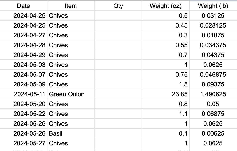
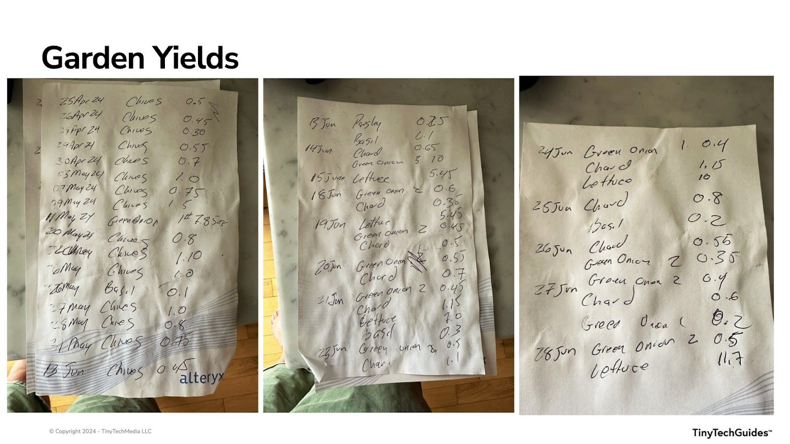
- Handwritten notes for this year’s yield: I had three pieces of paper with handwritten notes on yield for the current year. As you can see, I don’t have the best handwriting, but you should note that each line item may not necessarily have a date associated with it, and some of the entries have a quantity followed by weight.
- Weather data: My local area’s Historical weather data was downloaded from NOAA National Centers for Environmental Information (https://www.ncei.noaa.gov/cdo-web/). The weather variables considered included precipitation, maximum temperature, and minimum temperature.
Digitizing Handwritten Notes with OCR
Since I didn’t want to transcribe my poor handwriting to a Google Sheet manually, I used Optical Character Recognition (OCR) technology embedded in LLMs. This allowed me to convert my poor handwriting into structured data tables.
Given that the history of LLMs stems from image analysis and natural language processing (NLP), I hoped to use a LLM to extract the text from these images and convert it into structured data. I tested three of them:
- Perplexity.ai and ChatGPT successfully extracted the data
- Google Gemini struggled with the task
While the OCR results were largely accurate, the LLMs didn’t get everything right, but they did get about 99% of it right.
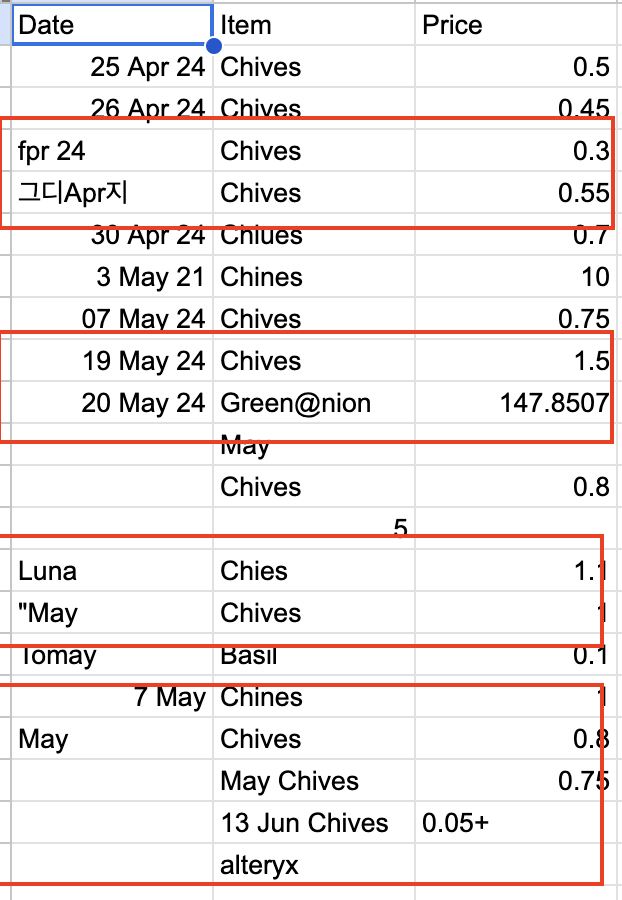
Sample OCR Data
| Date       | Item        | Quantity (oz) | Weight (lbs) |

|------------|-------------|---------------|--------------|

| 25 Apr 24  | Chives      | 0.5           | 0.03125      |

| 26 Apr 24  | Chives      | 0.45          | 0.02813      |

| 27 Apr 24  | Chives      | 0.30          | 0.01875      |

| 28 Apr 24  | Chives      | 0.55          | 0.03438      |

| 29 Apr 24  | Chives      | 0.7           | 0.04375      |

```
Data Cleaning
I cleaned the yield data by removing incomplete records and standardizing the format.
For example, it should be noted that one of the rows in the data was “1# 7.85 oz” in the weight column. The OCR was perfect, so I simply asked ChatGPT to convert that to ounces. It figured out that 1# was equal to 1 pound and did the appropriate conversion.
PROMPT:
Please convert the green onion 1# 7.85 oz to ounces
RESPONSE:
To convert 1 pound 7.85 ounces to ounces, you can use the following conversion:
1 pound = 16 ounces
So, 1 pound 7.85 ounces = 16 ounces + 7.85 ounces = 23.85 ounces
Here is the updated table with the conversion included:
I also asked it to standardize the dates.
PROMPT:
The first column is a date, please make all of the date formats consistent.
RESPONSE:
Here is the updated table with consistent date formats
Alignment
Yield and weather data were aggregated weekly for the analysis, allowing me to correlate weather conditions with corresponding garden yields.
Exploratory Data Analysis
To get started, I was still using Perplexity.ai and wanted to see what my yield was for the handwritten notes. However, Perplexity.ai cannot do data analysis like ChatGPT, so I switched over to ChatGPT for the remainder of the analysis.
PROMPT:
Make a pie chart of the data.
RESPONSE:
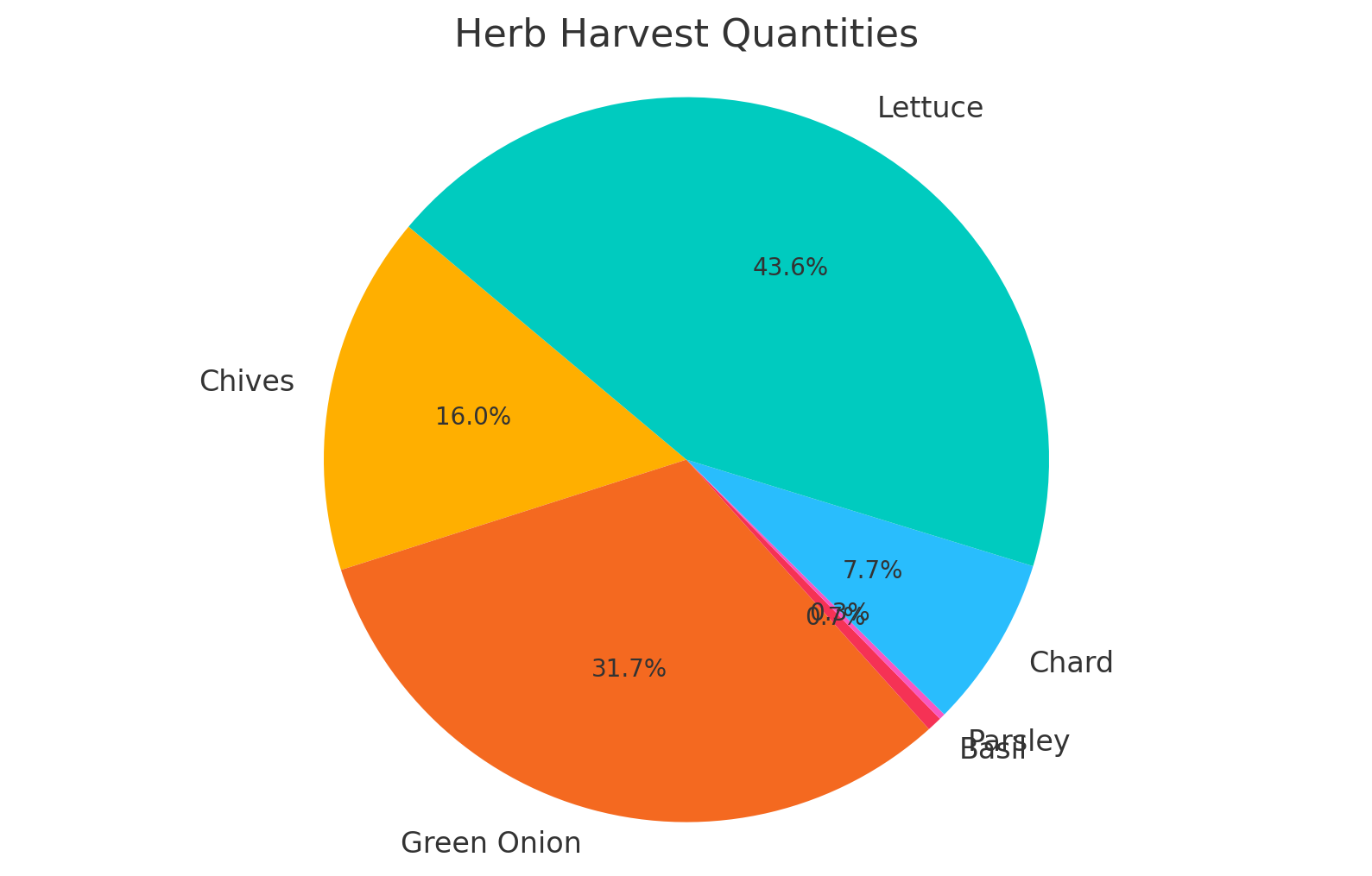
Here is the pie chart illustrating the quantities of different herbs harvested:
- Lettuce: 43.6%
- Green Onion: 31.7%
- Chives: 16.0%
- Chard: 7.7%
- Basil: 0.7%
- Parsley: 0.3%
PROMPT:
Create a trend chart by week of year. Limit the x-axis from week 10 to week 48.
RESPONSE:
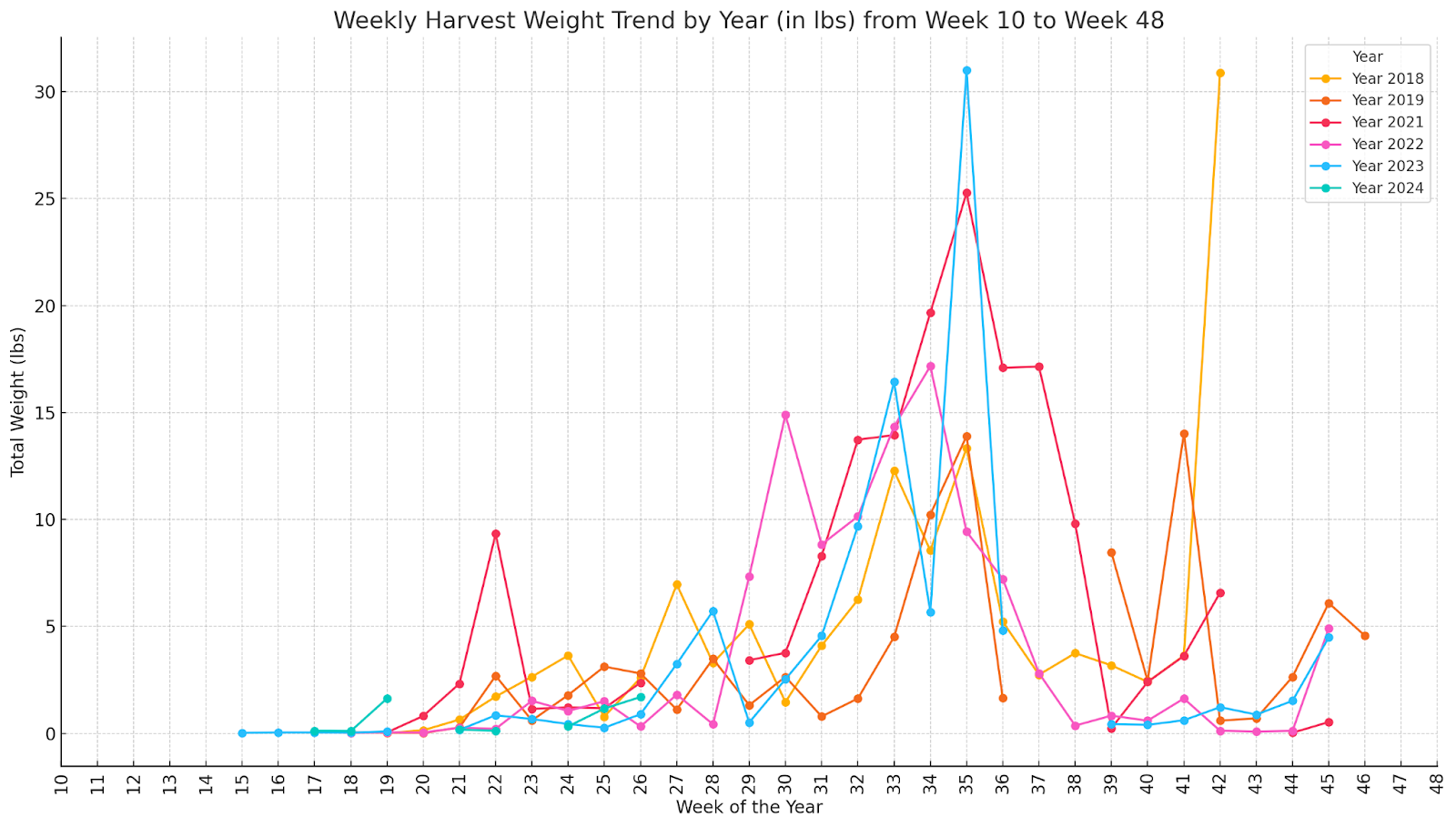
PROMPT:
Can you create a visualization comparing yields of different items by year for the top 10 items by sum of weight?
RESPONSE:
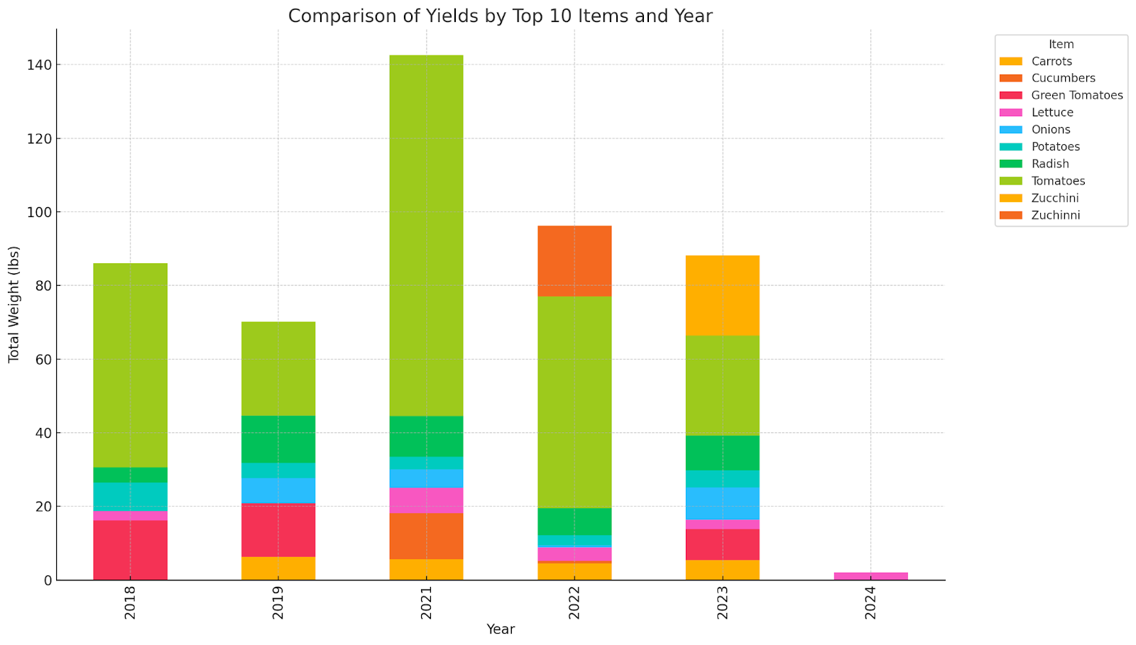
I’ve recreated the chart to focus on the top 10 items by total weight (lbs) across all years. This adjusted visualization offers a clearer view, showing how the yields of these predominant items have varied each year. Each bar represents a year, with segments detailing the contributions from each of the top 10 items.
PROMPT:
I abhor stacked bar charts, is there a a different way to visualize this?
RESPONSE:
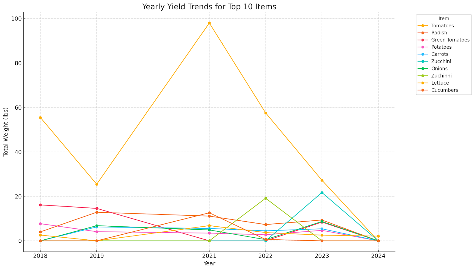
Here’s a line chart visualization for the yields of the top 10 items by total weight across different years. Each line represents one of the top items, illustrating the trend in their yields over the years. This format might provide a clearer view of the changes and comparisons between items year by year.
PROMPT:
How about side by side bars for each item grouped by year sorted in ascending order?
RESPONSE:
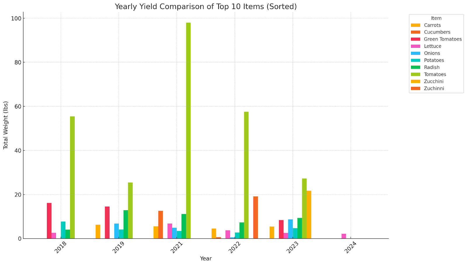
Here’s the updated side-by-side bar chart with the bars sorted in ascending order for each year. This layout provides a clearer comparison of how the yields for the top 10 items stack up against each other every year.
It didn’t quite do what I wanted, but close enough.
PROMPT:
Can you craft an executive summary of this?
RESPONSE:
Executive Summary: Garden Harvest Analysis
Overview: The analysis conducted on the garden harvest data from various years has provided valuable insights into the performance and yield trends of different crops. The data encompassed a wide range of items, with a focus on quantifying the yields in both ounces and pounds.
Key Findings:
- Top 10 Items by Yield:
- The top 10 items were identified based on their total weight contributions over the years. These items consistently represented the bulk of the garden’s output and included crops like Green Onion, Lettuce, Chives, and Chard.
- Yield Trends Over Time:
- There were noticeable fluctuations in the yields of the top items year over year, indicating variability influenced by factors such as gardening practices, weather conditions, and possibly changes in garden management.
- Visualization and Data Representation:
- Various visualizations were crafted to better understand the trends. Line charts revealed the year-to-year fluctuations in a clear manner, while bar charts provided a direct comparison of yields by year and item.
- Adjusted visualizations to present data sorted by yield within each year helped clarify the ascending order of item performance, making it easier to identify top performers at a glance.
Recommendations:
- Focus on High-Yield Crops:
- Prioritize cultivation and resource allocation towards the crops that consistently yield the most, such as Lettuce and Green Onion, to maximize garden productivity.
- Monitor and Adapt:
- Continue to monitor yield trends closely and adapt gardening practices to optimize growing conditions and address any declining trends in key crops.
- Further Analysis:
- Conduct further analysis to determine the causes of yield variability. Consider factors such as soil health, pest management, and crop rotation strategies.
This executive summary encapsulates the key points and recommendations based on the comprehensive analysis of the garden harvest data, aiming to support decision-making for future gardening endeavors.
Forecast Analysis
Next, let’s predict this year’s yield.
PROMPT:
Using all of the appropriate data, can you add a forecast line of yield for 2024?
RESPONSE:
To add a forecast line for the yield in 2024, I’ll use a simple forecasting method such as a linear regression model. This will project the future values based on past data trends. Let’s proceed with creating the forecast.
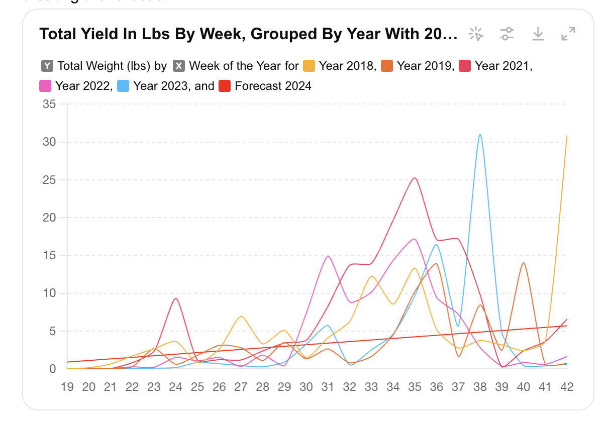
Here’s the plot with the forecast line for the yield in 2024. The red dashed line represents the predicted total yield in pounds for weeks 14 to 47 in 2024, based on the linear regression model using historical data.
PROMPT:
That doesn’t look right, it’s a straight line, the others are more curved, are there are predictive or forecasting methods that can be used?
RESPONSE:
Certainly! There are several more sophisticated forecasting methods that can capture seasonal trends and patterns better than a simple linear regression. One such method is the ARIMA (AutoRegressive Integrated Moving Average) model, which is suitable for time series forecasting.
Let’s use the ARIMA model to forecast the 2024 yields. I’ll implement this and update the plot accordingly.
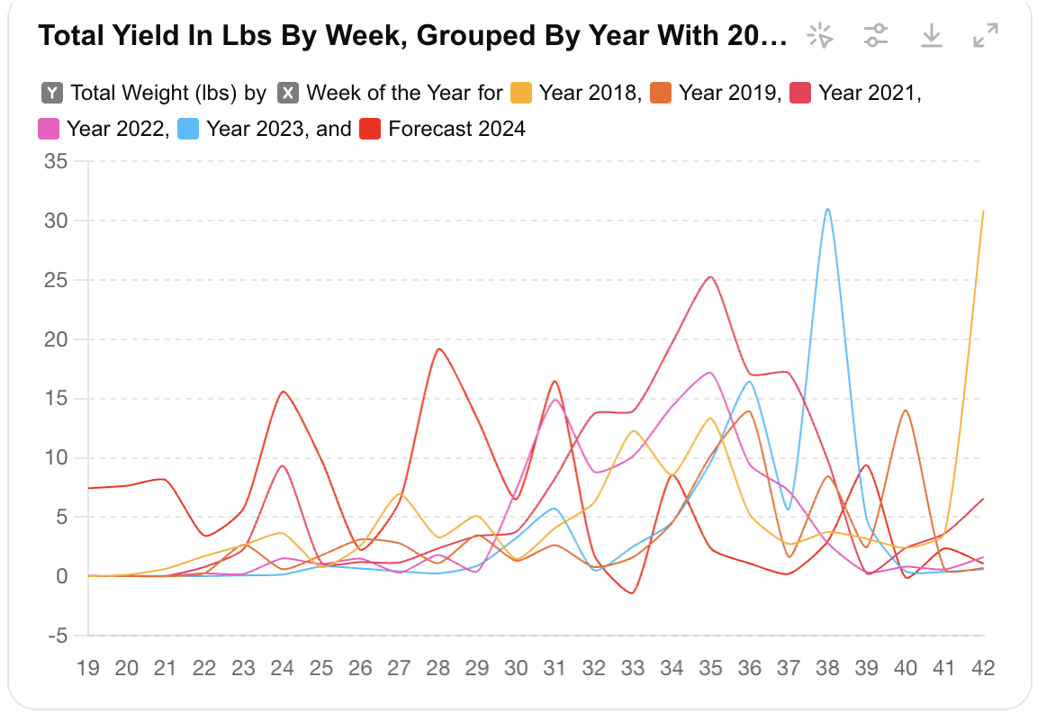
PROMPT:
What is the forecasted yield for 2024? how does this compare to previous years?
RESPONSE:
Forecasted Yield for 2024 and Comparison with Previous Years
Forecasted Yield for 2024:
- The total forecasted yield for 2024 (weeks 14 to 47) is approximately 172.92 lbs.
Total Yields for Previous Years:
- 2018: 125.34 lbs
- 2019: 92.17 lbs
- 2021: 164.06 lbs
- 2022: 108.03 lbs
- 2023: 97.23 lbs
Comparison:
- The forecasted yield for 2024 is higher than the yields for the previous years, indicating a potential increase in productivity. Specifically, the forecast for 2024 surpasses the highest observed yield in 2021, which was 164.06 lbs.
- This projected increase could be due to improved gardening practices, better weather conditions, or other favorable factors.
PROMPT:
What other analysis should I be doing?
RESPONSE:
To deepen your analysis and gain more insights, consider exploring the following areas:
1. Seasonal Analysis:
- Seasonal Trends: Examine the seasonal trends more closely to identify peak harvesting periods and any patterns that repeat annually.
- Yield Distribution: Analyze the distribution of yields across different seasons (spring, summer, fall) to optimize planting and harvesting schedules.
2. Item-Specific Analysis:
- Top Performing Crops: Identify which crops consistently yield the most and evaluate their growing conditions, planting schedules, and maintenance practices.
- Crop Rotation Impact: Assess the impact of crop rotation on yields and soil health to enhance productivity and sustainability.
3. Year-over-Year Performance:
- Growth Trends: Analyze the year-over-year growth trends for different items to understand long-term productivity changes.
- Anomaly Detection: Identify any anomalies or outliers in the data to understand unexpected changes in yields and their causes.
4. Weather and Environmental Impact:
- Weather Correlation: Correlate yield data with weather patterns (temperature, rainfall) to identify how environmental factors impact productivity.
- Climate Change Impact: Assess the potential impacts of climate change on your garden’s yields over time.
5. Efficiency and Productivity:
- Labor and Input Costs: Analyze the labor and input costs associated with each crop to understand the return on investment (ROI) for different items.
- Space Utilization: Evaluate how efficiently garden space is being utilized and explore ways to optimize space for higher yields.
6. Soil Health and Fertility:
- Soil Analysis: Conduct soil tests to understand nutrient levels and pH balance, and correlate this data with yield performance.
- Fertilizer Impact: Assess the impact of different fertilizers and soil amendments on crop yields.
7. Pest and Disease Management:
- Pest Impact: Analyze the impact of pests and diseases on yields, and evaluate the effectiveness of different pest management strategies.
- Preventive Measures: Identify preventive measures that have proven effective in protecting crops from pests and diseases.
8. Forecast Accuracy:
- Model Evaluation: Evaluate the accuracy of the forecasting models by comparing predicted yields with actual yields once the season is over.
- Model Improvement: Explore advanced forecasting models (e.g., machine learning models) to improve yield predictions.
9. Economic Analysis:
- Market Prices: Analyze how market prices for different crops fluctuate and assess the economic value of your garden’s output.
- Profitability: Calculate the profitability of different crops by comparing yield data with market prices and input costs.
10. Community and Sharing:
- Knowledge Sharing: Share your findings and best practices with other gardeners and communities to learn from their experiences and insights.
- Collaborative Projects: Engage in collaborative projects with local agricultural institutions or universities to further enhance your garden’s productivity.
These analyses can provide a comprehensive understanding of your garden’s performance, helping you make informed decisions to optimize yields, improve sustainability, and increase profitability. If you need assistance with any specific analysis, feel free to ask!
Seasonal Yield Distribution Analysis
Objective
Next, based on ChatGPT’s inspiration, I wanted to analyze how garden yields are distributed across different seasons—Spring, Summer, and Fall—and identify significant patterns or trends.
Methodology
I categorized the yield by season based on the harvest dates. Each year’s data was segmented into Spring (March to May), Summer (June to August), and Fall (September to November). I then calculated the total yield for each season.
Results
The bar chart below illustrates the seasonal yield distribution by year.
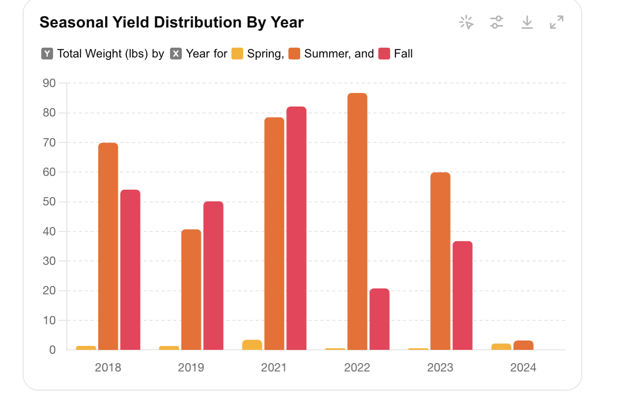
Insights
- Spring: Yields during Spring were generally moderate, marking the start of the growing season.
- Summer: Summer consistently showed the highest yields, benefiting from optimal growing conditions.
- Fall: Fall also had significant yields, particularly for late-season crops.
Weather Correlation Analysis
Objective
Next, I wanted to understand the impact of weather conditions on garden yields, so I downloaded some weather data to examine the correlation between key weather variables and garden yields.
Methodology
Based on the weather data, I decided to focus on three primary weather variables: precipitation (PRCP), maximum temperature (TMAX), and minimum temperature (TMIN).
Results
The correlation matrix below highlights the relationships:
| Variable        | Correlation with Yield |

|-----------------|------------------------|

| Precipitation   | -0.060                 |

| Max Temperature | 0.184                  |

| Min Temperature | 0.270                  |
Scatter Plots
To visualize these relationships, I created scatter plots:
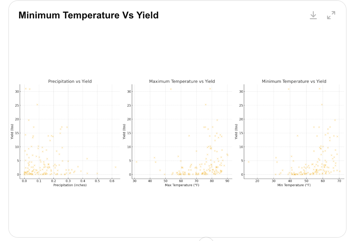
Insights
- Temperature Impact: Both maximum and minimum temperatures positively correlated with yields, with minimum temperature having a stronger substantial effect. Warmer conditions, especially at night, appeared beneficial for garden productivity.
- Precipitation Impact: The weak negative correlation with precipitation suggested that excessive rainfall might slightly hinder yields, though the overall impact was minimal.
This analysis revealed key insights into how weather conditions impact garden yields. Warmer temperatures, particularly at night, positively influenced productivity, while excessive rainfall had a minimal negative effect.
Conclusion
The following observations were noted after experimenting with LLM for OCR and analytics.
Using LLMs for OCR
- LLMs proved useful for digitizing handwritten notes. However, two of the three LLMs read the handwritten notes without issue, while one (Gemini) yielded extremely poor results.
- Even though LLMs are great at OCR, you still need to verify the digitized records, as they can and do make mistakes. However, they’re pretty accurate.
Using LLMs for Data Prep
- LLMs were very effective at combining multiple files and standardizing the variable formats.
Using LLMs for Data Analytics
- Perplexity.ai could generate Python code but could not run the Python code for the analytics.
- The latest version of ChatGPT now has interactive charts included in the data analytics output.
- Once you leave the ChatGPT session for a long period of time, it struggles to recreate the original analysis. It is best to start over.
Using LLMs for Brainstorming and Executive Summaries
- If you’re not familiar with how to do something, just ask. LLMs do a great job at providing step-by-step instructions on how to perform various tasks.
- LLMs can be used to create executive summaries of the results.
- LLMs can also be used to brainstorm different types of analytics that could be applied to your data.
I think my forecasted yield of 172.9 lbs is a bit high, but we can only hope.
Happy gardening!
If you’re interested in the Square Foot Garden method, check out Mel’s book on Amazon.
If you enjoyed this article, please like it, highlight interesting sections, and share comments. Consider following me on Medium and LinkedIn.
Please consider supporting TinyTechGuides by purchasing any of the following books.
- Generative AI Business Applications: An Exec Guide with Life Examples and Case Studies
- The CIO’s Guide to Adopting Generative AI: Five Keys to Success
- Mastering the Modern Data Stack
- Modern B2B Marketing: A Practioner’s Guide for Marketing Excellence
- Artificial Intelligence: An Executive Guide to Make AI Work for Your Business
.
Related Posts

AI Agents – State of the Union with Sanjeev Mohan

The Best of AI in 2024: Must-Read Articles for Success in 2025